

Your desktop rankings mean nothing if your mobile experience is broken. Google indexes the mobile version of your site first, and over 60% of global web traffic now comes from phones. These are the mobile SEO practices that actually move rankings, from the tools that automate the work to the technical fixes you can run this week.
Where Distribb fits
Distribb is an AI SEO system built for people who want organic traffic without managing every moving part manually. You connect your site, tell Distribb what you sell, and it does the research, writing, scheduling, and publishing for you.
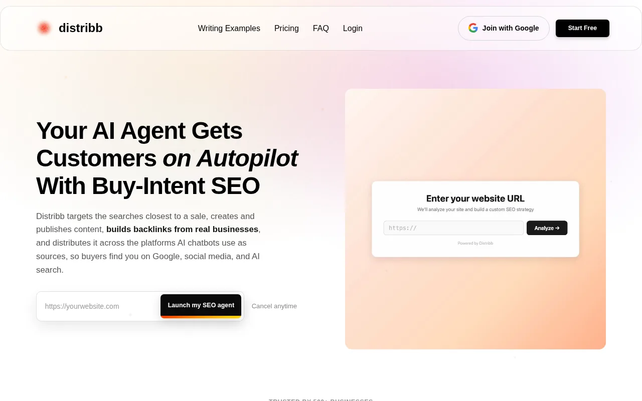
On the mobile SEO side specifically, Distribb generates long-form articles with clean structure, internal and external links, FAQ blocks, and E-E-A-T-focused writing. Every piece is built to rank and get cited, which matters more than ever as AI search surfaces structured content. It integrates directly with WordPress, Webflow, Shopify, Wix, and webhooks, so content goes live on your schedule without manual uploads.
The keyword research engine finds high-intent terms with real search volume. Instead of chasing vanity keywords, it targets achievable opportunities based on your niche and competitor landscape. A rolling 30-day content calendar stays stocked automatically as new topics surface.
Distribb's backlink exchange also earns contextual links from real businesses inside its network, tracked from your dashboard.
The honest caveat: Distribb handles the content pipeline and SEO fundamentals well, but you'll still want to handle technical site issues like server response times and Core Web Vitals separately. It's an SEO engine, not a site developer. For teams who publish regularly and want to scale organic traffic without scaling headcount, it covers the content side of this list.
If you want to understand what else Distribb automates beyond content, the guide on using AI for automated on-page SEO optimization walks through the full workflow.
1. Mobile-First Indexing, How Google Actually Crawls Your Site
Google uses the mobile version of your site for indexing and ranking. That's been the rule since the rollout completed in 2024. Googlebot's smartphone crawler determines what content, links, and structured data enter the index, which then drives rankings for both mobile and desktop searches.
The practical consequence most teams miss: if your desktop site has richer navigation, more internal links, or more structured data than your mobile version, that advantage is effectively invisible to Google. The mobile version is the version that counts. If the mobile template is missing markup the desktop one has, the free schema markup generator produces the JSON-LD to paste back in.
There are three ways to set up a mobile site. Responsive design serves identical HTML on a single URL, with CSS adjusting the layout per device. Dynamic serving delivers different HTML based on the device type while keeping the URL the same, though it has some notable disadvantages. Separate URLs serve different HTML and different URLs, but take time to maintain due to the different URLs. Google recommends responsive design because it eliminates duplicate content risk and simplifies crawling.
If you use separate URLs (the m.subdomain approach), you need to get a few technical details right. When you use rel=hreflang link elements for internationalization, link between mobile and desktop URLs separately. You also need correct rel=canonical and rel=alternate tags so Google knows which version is primary. Miss either of these, and Google may treat your pages as duplicates.
One common mistake that tanks mobile rankings: using a noindex tag on mobile pages. If your robots meta tags differ between desktop and mobile, Google won't index the mobile version when your site is crawled with the smartphone agent. Use the URL Inspection tool in Search Console to check what the smartphone crawler sees before it becomes a ranking problem.
2. Core Web Vitals & Site Speed, Winning Google's Performance Tests
Core Web Vitals are Google's main performance benchmark. Three metrics matter most: Largest Contentful Paint (LCP), which measures how fast the main content loads; Interaction to Next Paint (INP), which tracks how quickly the page responds to a tap; and Cumulative Layout Shift (CLS), which measures whether elements jump around as the page loads. These are direct ranking factors, not suggestions.
Mobile performance is harder than desktop. Google collects Core Web Vitals data from real Android users on real 4G connections. A page that loads in 1.2 seconds on a desktop fiber connection may have an LCP of 3.8 seconds on a mid-tier Android phone, which is a failing score. Mobile optimization means accounting for slower CPUs and inconsistent networks, not just network transfer speed.
Start by measuring. Run your most important pages through PageSpeed Insights, which shows your Core Web Vitals for both mobile and desktop with specific diagnostics. Don't guess which metric is failing. The fix for a bad LCP score is different from the fix for a CLS problem.
For LCP: images are usually the culprit. Move to WebP format, which delivers smaller file sizes at equal quality. Add explicit width and height attributes to every image so the browser reserves space before the image loads. Missing image dimensions are the single most common cause of CLS failures, and fixing them is often a one-afternoon task that improves multiple Core Web Vitals at once.
For INP: JavaScript is the usual problem on mobile. A script that takes 150ms to execute on a MacBook may take 600ms on a mid-range Android. Code splitting, deferring non-critical scripts, and removing unused JavaScript all reduce the processing load on slower devices.
Lazy loading is worth doing on every site. Load images and videos only when they scroll into view. There's no reason to load content at the bottom of a page during the initial render. It directly speeds up perceived load time and helps LCP. Use the loading="lazy" attribute on any image that isn't visible in the first screen of content.
For teams building on modern JavaScript frameworks with built-in image components, srcset generation, WebP conversion, and layout shift prevention can be handled automatically when images are sized correctly. For everyone else, the fixes are manual but straightforward.
3. Image Optimization, Faster Load Times, Lower Bounce Rates
Unoptimized images are the most common reason mobile pages fail Core Web Vitals. A 2MB hero image that looks fine on desktop is a disaster on a 4G connection. The fix isn't complicated, but it requires doing it consistently across every page.
Switch to WebP. It's significantly more efficient than JPEG or PNG at the same visual quality. Most CMSs support it now, and most browsers have for years. If your image pipeline still outputs PNG by default, change that setting first. It's the fastest image quality win available.
Use responsive images with the srcset attribute. Serving an oversized image to a small mobile screen wastes bandwidth and slows load time. The srcset attribute lets the browser pick the right image size for the device. A basic implementation looks like this: serve three sizes (small, medium, large) and let the browser decide.
Always set explicit width and height on every image tag. When a browser doesn't know an image's dimensions before it loads, it can't reserve space in the layout. That causes content to jump as images arrive, which drives up your CLS score. This single oversight appears across so many sites that fixing it often produces measurable ranking improvements.
For large sites, use an image CDN or at minimum enable compression at the server level. A content delivery network serves images from a location physically closer to the user, cutting the round-trip time. Combined with WebP and proper sizing, it's usually enough to move a failing LCP into the passing range.
Check image sitemaps if you rely on image search traffic. Google Search Console can surface issues with image indexing that aren't obvious from the front end.
4. Thumb-Friendly UI & Scannable Formatting, UX That Ranks
Mobile users navigate with their thumbs, not a mouse. A design that ignores that reality creates friction that drives up bounce rates and suppresses rankings indirectly through poor engagement signals.
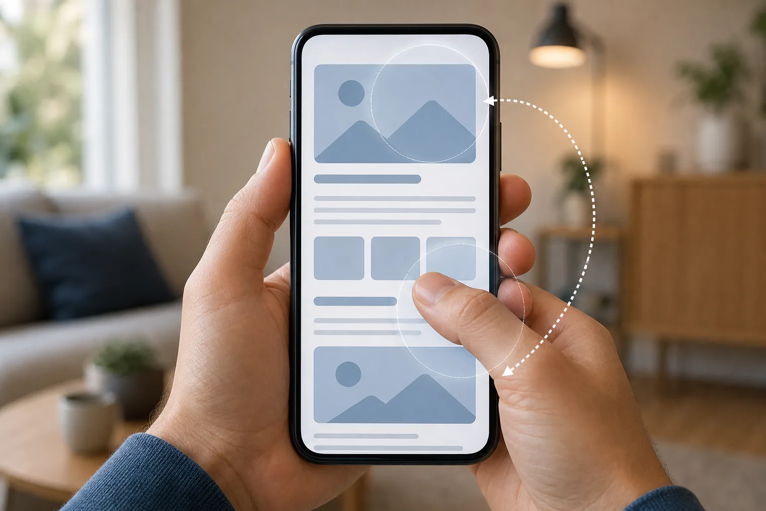
Tap targets need to be at least 44x44 CSS pixels. Smaller than that and users miss buttons, tap the wrong link, or give up. This isn't a design preference, it's a usability standard, and a proper SEO audit checklist will flag tap targets that fall below the recommended minimum. Buttons clustered too close together are just as bad, because accidental taps signal poor UX.
Place navigation elements in the lower portion of the screen where thumbs naturally rest. Hamburger menus save space and work well on mobile, but the icon needs to be recognizable and easy to open one-handed. Sticky navigation is fine as long as it doesn't consume too much vertical space on smaller screens.
Content formatting matters as much as layout. Keep paragraphs to two or three sentences. Long text blocks feel like walls on a 390px-wide screen. Use clear H2 and H3 headings, white space between sections, and bullet points for scannable lists. Font size should be at least 16px. Anything smaller forces users to pinch and zoom, which increases frustration and abandonment.
Forms deserve special attention. Use the right input types so mobile keyboards match the field. A phone number field should trigger a numeric keypad, not a full QWERTY keyboard. Enable autofill compatibility where possible. Every tap saved in a form is a small win for completion rates.
5. Optimized Title Tags & Meta Descriptions, Click-Through Rate on Mobile
Mobile search results show less text than desktop. Title tags get cut off around 55-60 characters. Meta descriptions have even less room. If your titles and descriptions aren't written for small screens, you're losing clicks before users even hit your page. The free SERP preview tool shows the cut-off point for both before you publish.
Front-load the most important words in your title tag. Put the keyword topic near the start, not buried at the end. On a phone, a user sees the first 50-55 characters clearly before truncation. A title like "Mobile SEO Guide: Best Practices for 2026 | Brand" loses "| Brand" on most phones, which is fine. A title that buries the topic after the brand name loses the keyword that tells users the page is relevant.
Meta descriptions aren't a direct ranking factor, but they drive click-through rate, which matters. Write them as a one-sentence value proposition. What will the user find on this page that they can't find elsewhere? Answer that question clearly, include a natural reference to the search topic, and keep it under 155 characters.
Make sure title tags and meta descriptions are consistent between your desktop and mobile versions. If you use dynamic serving or separate URLs, inconsistencies here are a common source of ranking drops after mobile-first indexing takes effect. Equivalent metadata across both versions is required.
One overlooked tactic: check your existing pages in Google Search Console for queries with high impressions but low click-through rates. Those pages have a visibility problem, not a ranking problem, and rewriting the title and description is often all it takes to fix it. It's faster than building new content and often produces results within a few weeks.
6. Structured Data & Schema Markup, Earning Rich Snippets on Mobile
Structured data helps Google understand what your content is about and makes your pages eligible for rich results. On mobile, rich snippets stand out more because screen space is limited. A result with star ratings, a price, or an FAQ block visible directly in search draws more attention than a plain blue link.
Schema markup is the standard format for structured data. Use JSON-LD, which Google recommends because it can be placed in the page head without interfering with the visible content. Common schema types include Article, FAQ, HowTo, Product, and LocalBusiness. Each tells Google something specific about your content that it can surface in search features.
The mistake most sites make: implementing schema on desktop pages only. Google pulls structured data from the mobile version first. If your schema only lives in the desktop template, you lose rich snippet eligibility entirely. Check both versions when you implement any schema type.
FAQ schema is worth prioritizing. Pages with FAQ schema are significantly more likely to be cited in AI search outputs, which is increasingly important as AI search surfaces structured content. The FAQ section on your page should answer the real questions users type, and the schema should match the on-page content exactly.
Validate your markup after implementing it using a structured data testing tool. It shows which schema types are found, whether they're eligible for rich results, and any errors that would disqualify the page. Run it on mobile specifically to confirm the smartphone crawler sees the same structured data as the desktop crawler.
7. Voice Search Optimization, Capturing Conversational Mobile Queries
Voice search is growing, and it's almost entirely a mobile behavior. People ask voice queries differently than they type. Instead of "best pizza Chicago," a voice query sounds like "what's the best pizza place near me right now?" Your content needs to match that conversational pattern to show up.
Target question-based long-tail keywords. Find the exact questions your audience asks, then answer them directly in your content. The answer should appear in the first sentence of the relevant section, not buried three paragraphs in. AI systems and voice assistants pull answers from content that leads with the direct response.
Natural language matters here. Write the way people speak. If your industry uses jargon, also include the plain-language version. Someone asking a voice assistant is usually asking informally, and content that sounds like a press release won't match the conversational query pattern that voice search relies on.
Featured snippets and position-zero results are the most common source of voice search answers. To target them, identify queries where a featured snippet already exists in Google, then write a better, more direct answer to that question. Paragraph snippets, list snippets, and table snippets all have slightly different formatting requirements, but all of them reward clear, direct answers at the top of a section.
Local voice queries deserve specific attention. "Near me" searches are almost always voice or mobile. Optimizing for local search and voice search overlap significantly, which leads directly to the next practice.
8. Local SEO for Mobile, Winning Location-Based Searches
A large portion of mobile searches have local intent. Users looking for a restaurant, a plumber, or a store nearby are almost always searching on their phone. If your local SEO isn't in order, you're invisible to the people closest to buying.
The foundation is your Google Business Profile. Keep it complete and accurate: business name, address, hours, categories, photos, and regular posts. Google uses this data to determine local pack placement, the three-result map block that appears for most local queries. A complete profile with recent activity performs better than an incomplete or stale one.
On-page local SEO follows the same pattern. Include your city, neighborhood, or service area naturally in title tags, H1 headings, and the opening paragraph of location pages. For businesses serving multiple areas, build dedicated pages per location rather than cramming all locations onto one page. Each page should target a specific geographic keyword combination. The guide on keyword research for local SEO covers how to build that keyword list efficiently.
Schema markup for local businesses (LocalBusiness schema) gives Google structured information about your address, phone number, hours, and service area. It increases your chances of appearing in local rich results and the knowledge panel. Add it to your homepage and any location-specific pages.
Mobile users searching locally often act fast. They're in the moment, close to a decision. Your listing needs a clear call to action, an accurate address, and click-to-call functionality. Friction at this stage costs you customers who are already in buying mode.
9. Avoiding Intrusive Pop-Ups & Interstitials, Dodging Google Penalties
Google has explicitly penalized intrusive interstitials on mobile since 2017, and that policy is still enforced. A pop-up or overlay that covers the main content immediately when a page loads on mobile triggers a ranking demotion. It doesn't matter how good the rest of your page is.
The specific types that draw penalties: pop-ups that cover the main content and can't be dismissed easily, interstitials that appear before the content loads, and overlays that require scrolling past a large ad block to reach the page content. These are all violations of Google's page experience signal.
What's allowed: cookie consent banners (legally required in many regions), age verification gates, and small banners that use a reasonable portion of screen space. These serve a clear purpose and don't hide the main content. Use them without worry.
If you run email capture pop-ups, trigger them on scroll depth or exit intent rather than on page load. A pop-up that fires after a user has read 60% of an article is a very different experience from one that fires the moment the page opens. One shows timing awareness; the other interrupts before the user has seen any value.
Check your Google Search Console page experience report regularly. If a page is flagged for intrusive interstitials, fix it before it costs you rankings. This is one of the rare SEO penalties that is completely within your control to avoid.
10. AI-Powered SEO & Real-Time Performance Monitoring, The 2026 Edge
The gap between teams that monitor in real time and teams that check reports weekly is widening. When you push a site update that breaks your CLS score, knowing about it in 30 seconds is different from knowing about it in 10 days. By then, rankings have already moved. Tools that close the loop between monitoring and the work itself are compared in our roundup of automated SEO software.
Distribb sits in this space by connecting content automation to performance. Instead of manually checking keyword rankings and content gaps, the platform surfaces opportunities and publishes content on a rolling schedule. For teams that want to automate SEO audits with AI, this kind of continuous monitoring replaces the manual weekly check-in with a system that surfaces issues as they happen.
Google Search Console is still non-negotiable as a baseline. It shows real Google data: actual impressions, clicks, average positions, and index coverage. Every other tool estimates your performance from crawled data. Search Console gives you the source truth. Connect it to everything and check the performance report at least twice a week.
For deeper mobile performance work, PageSpeed Insights and Google Lighthouse both give granular breakdowns of Core Web Vitals by page. You can use them to test staging environments before pushing changes live, the kind of workflow that catches problems before Google does.
AI-driven tools in 2026 also track visibility across non-traditional search channels. Some platforms now monitor brand presence in ChatGPT, AI Overviews, Perplexity, and other AI answer engines alongside traditional Google rankings. For teams where AI search visibility matters, tracking both channels from one place is worth the investment. The SEO software market reflects this shift, with cloud-deployed AI tools now the dominant infrastructure.
11. Mobile Usability Testing & Ongoing Audits, Catching Issues Before Google Does
A one-time mobile audit is not enough. Sites change. CMSs push updates. Third-party scripts add layout shifts. New pages go live without being tested on real devices. Ongoing audits catch the issues that accumulate between major site reviews.
Start with a browser's built-in developer tools for quick responsive testing. The device toolbar lets you simulate different screen sizes and network conditions. You can throttle the CPU to simulate a mid-range Android phone, which is how Google's PageSpeed Insights benchmarks performance. Testing on simulated conditions is fast, but real device testing is still necessary, simulators miss touch interaction issues and real-world rendering quirks.
Google Search Console's coverage and page experience reports are your early warning system. Set up regular checks for mobile usability errors, Core Web Vitals failures, and indexing issues. If a page drops from the index, the Search Console coverage report usually shows why within a few days.
For larger sites, a technical crawl tool catches issues at scale. Site crawlers can identify broken internal links, redirect chains, missing meta tags, duplicate content, and structured data errors across thousands of pages in minutes. External SEO tools such as Ahrefs or Semrush are well-known options for this kind of audit work. Run a full crawl monthly, or after any major site migration.
One specific check that often gets skipped: verify that collapsed mobile navigation items are present in the HTML source. If a hamburger menu hides links using JavaScript that requires user interaction to trigger, those links may not be followed by Googlebot's smartphone crawler. Use CSS display toggling instead, which keeps links in the DOM and accessible to the crawler regardless of visual state.
After any significant technical fix, re-run your Core Web Vitals checks and compare before-and-after scores in Search Console. The field data takes a few weeks to update, but lab data from PageSpeed Insights shows the change immediately. Tracking both gives you confidence that the fix actually worked.
What to Prioritize First, A Quick Mobile SEO Checklist
Not every practice here has the same impact. Some are one-time technical fixes with lasting effects. Others are ongoing processes. This table breaks down priority, effort, and what to measure so you can sequence the work sensibly.
| Practice | Priority | Effort | Measure With |
|---|---|---|---|
| Responsive design / viewport tag | Critical | Low (if on modern CMS) | Search Console, browser developer tools |
| Core Web Vitals (LCP, INP, CLS) | Critical | Medium | PageSpeed Insights, Search Console |
| Image optimization (WebP, srcset, dimensions) | High | Low–Medium | PageSpeed Insights, LCP score |
| Structured data on mobile version | High | Low | Structured data validation tools |
| Title tags & meta descriptions | High | Low | Search Console CTR report |
| Thumb-friendly UI (tap targets, font size) | High | Low–Medium | Real device testing, bounce rate |
| Remove intrusive interstitials | High | Low | Search Console Page Experience |
| Voice search / question-based keywords | Medium | Medium | Featured snippet tracking |
| Local SEO (GBP, LocalBusiness schema) | Medium (local businesses) | Low | Local pack rankings, GBP insights |
| AI-powered content and monitoring | Medium–High | Low (with Distribb) | Organic traffic, ranking changes |
| Ongoing mobile usability audits | Ongoing | Low (with tooling) | Search Console, crawl reports |
Fix the critical items first. A site with failing Core Web Vitals or a broken mobile viewport is leaving ranking potential on the table regardless of how good the content is. Once the technical foundation is solid, shift focus to content quality, structured data, and voice search optimization. For new websites building their SEO foundation, this sequence matters especially, since technical issues early on can delay indexing for months.
FAQ
What is the most important mobile SEO factor right now?
Core Web Vitals are the most directly tied to rankings because Google uses them as a confirmed ranking signal. LCP, INP, and CLS are measured from real mobile users on real devices. A site that passes all three has a measurable advantage over one that fails, even with similar content. Fix image dimensions and eliminate render-blocking scripts first, as those two changes address the most common failures across all three metrics.
Does Google penalize sites that aren't mobile-friendly?
Not with a manual penalty, but the effect is the same. Google indexes the mobile version of your site first, so a weak mobile experience directly limits how well your pages can rank. Pages that fail the page experience signal (which includes Core Web Vitals, HTTPS, and no intrusive interstitials) are eligible for ranking demotions. The practical outcome is that non-mobile-friendly sites consistently underperform in search regardless of their content quality.
How do I check if my site passes Google's mobile requirements?
Run your key pages through PageSpeed Insights for Core Web Vitals data. Check your Google Search Console for the Page Experience and Coverage reports. Use your browser's built-in device emulation tools to spot layout issues quickly. For a full technical picture, a dedicated crawl tool can surface issues across all pages at once rather than checking one page at a time.
Is responsive design really better than separate mobile URLs?
For most sites, yes. Responsive design serves identical HTML on one URL, which avoids duplicate content risk, simplifies crawling, and removes the need for hreflang and canonical tag management between versions. Separate mobile URLs (m.subdomain) require more maintenance and introduce more ways to make technical errors that hurt indexing. Unless you have a specific technical reason for separate URLs, responsive design is the cleaner choice.
How does voice search change my keyword strategy?
Voice queries are conversational and usually phrased as full questions. Instead of targeting "mobile SEO tips," you'd target "what are the best ways to improve mobile SEO?" Find question-based long-tail keywords, answer them directly in the first sentence of the relevant section, and use FAQ schema to help Google surface your answers. This also improves your chances of appearing in AI search outputs, where direct, structured answers get cited most often.
Can AI tools actually help with mobile SEO, or is that overhyped?
AI tools help most with the parts of SEO that are repetitive and time-consuming: keyword research, content planning, writing, and publishing at scale. Distribb handles all of these automatically, which lets teams maintain a consistent publishing cadence without manual effort. What AI doesn't replace is technical site work, fixing Core Web Vitals, optimizing images, and configuring structured data still requires hands-on implementation, at least for now.
Conclusion
Start with the technical foundation: responsive design, passing Core Web Vitals scores, and structured data present on your mobile version. Those three things determine whether Google can index and rank your pages at all. Once they're solid, layer in content quality, voice search optimization, and local SEO. If you want to scale the content side without scaling your team, Distribb automates the keyword research, writing, and publishing so the pipeline stays full. Start the 7-day free trial from Distribb pricing and connect your site to see how the content workflow runs.