

A podiatry website needs to answer a patient’s first questions fast: what care is available, who provides it, and how to book. These six podiatry websites and practice examples show different ways to frame foot and ankle care. As you browse, keep an eye on the basics, and see how podiatry SEO can support a clinic’s visibility.
1. Chicagoland Foot and Ankle: A local-practice website to study
Chicagoland Foot and Ankle is a useful name to include when you’re looking for local-practice examples. Its name points to a clear geographic focus, which gives clinic owners a simple prompt: can a new patient tell where the practice works and which communities it serves?
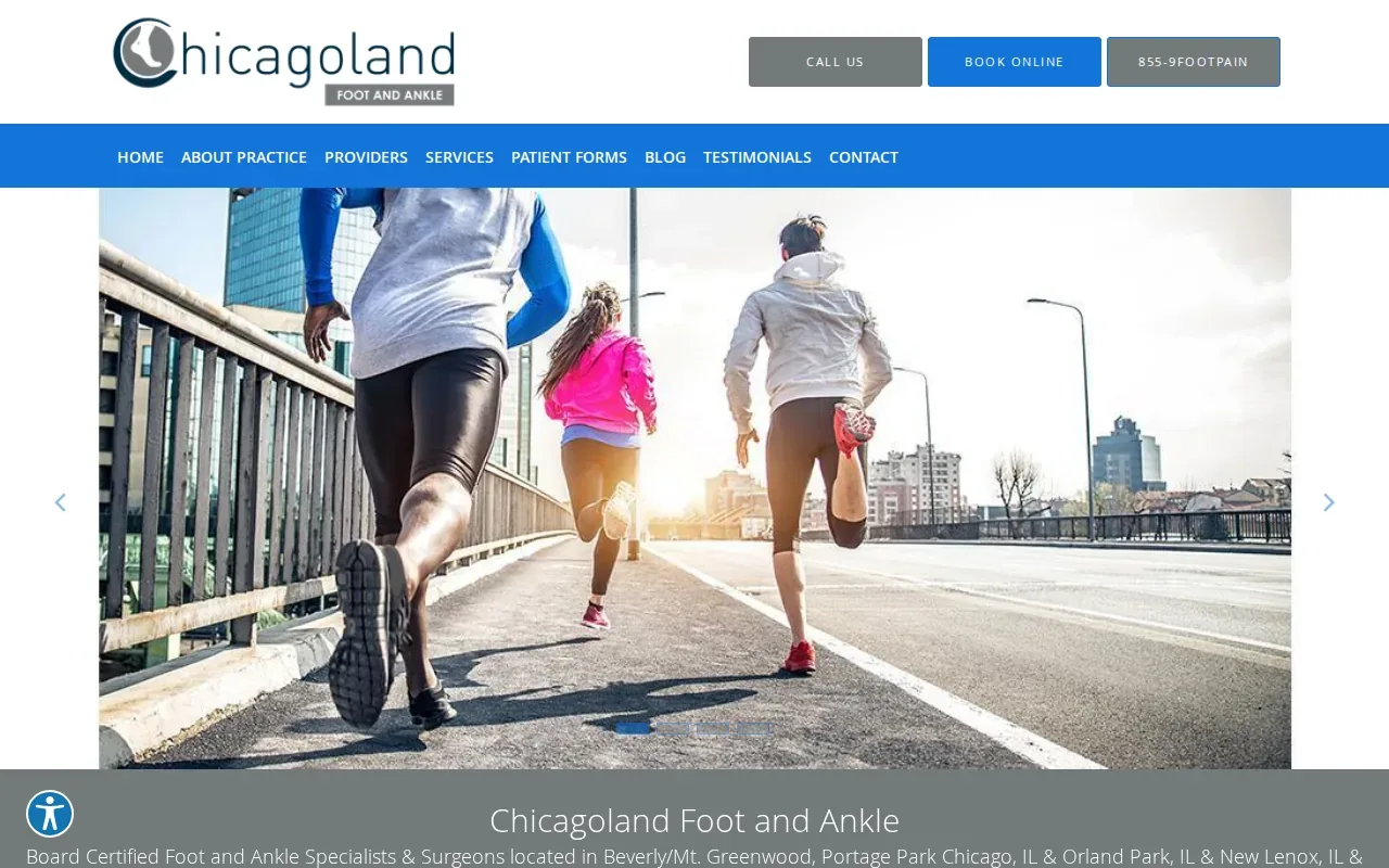
When you review its site, check how quickly the location comes into view. Then look for the details a patient needs before booking: the clinic’s address, its service area, and a clear path to schedule an appointment. These details should be easy to find on a phone, where a patient may be checking the site between errands.
Use the same review to see how the practice explains its care. A strong service page names the problem in terms patients use, such as heel pain or bunions, then explains what kind of help the clinic provides. A short provider bio can also help a visitor understand who they may see and what credentials that person has.
For your own clinic, make each location page useful on its own. Include relevant services and local details rather than relying on a single generic page. If you’re also weighing outside marketing support, this comparison of podiatry marketing agencies covers a related decision.
2. Modern Foot & Ankle: A contemporary brand to examine
Modern Foot & Ankle gives you a compact name to study for brand messaging. It puts the care area first, then adds a word that suggests a current approach. The useful lesson isn’t to copy the wording. It’s to check whether your own name and home page make the practice’s focus clear without asking visitors to decode industry terms.
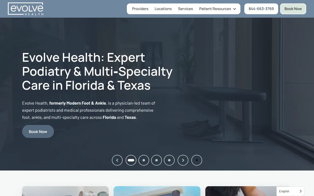
As you explore this example, notice how the site handles the handoff from brand to patient needs. Can a visitor quickly find the conditions treated? Are provider details easy to reach? Is the next step for booking plain? Those checks matter because a polished name cannot take the place of clear service information.
For a clinic’s own site, keep a patient’s likely question in view. Someone with toe pain may want to know whether the practice treats that issue, what kind of clinician provides care, and how to request an appointment. Put the answers near the relevant service rather than burying them in a long practice overview.
Also check the mobile view. Small screens can push key details below the fold or make menus hard to use. If the page takes too long to load, a visitor may leave before they reach the booking step.
3. Balance Foot & Ankle: A broad-care message for patients
Balance Foot & Ankle describes care that spans prevention, foot and ankle health, wellness, and surgery. The practice also says its specialists consider foot structure and how it affects the rest of the body. That gives this example a clear message to examine: it connects a range of care options to a broader view of the patient.
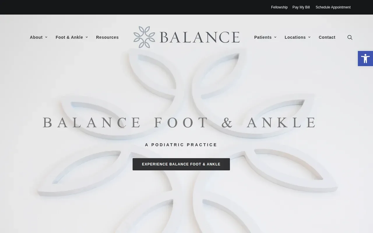
A broad message can help a visitor understand that a clinic sees more than one kind of foot or ankle concern. But the service list still needs structure. Group conditions in a way patients can scan, and give each important service enough context to explain what the clinic treats. A long string of medical terms may be accurate, yet still leave a patient unsure where to start.
Balance also describes its desired patient experience as warm and compassionate. A practice can make that value easier to understand through plain language, useful provider biographies, and clear explanations of what happens next. The site should let a patient find the next step without guessing which page to open.
As a review exercise, compare the practice’s broad positioning with its individual service details. If you’re building a site, pair a concise overview with focused pages for common concerns. That way, the home page can introduce the practice while service pages answer specific questions.
4. Ankle & Foot Centers of America: A multi-location care example
Ankle & Foot Centers of America describes a group that began in Atlanta in 1982 and has grown into a large group of podiatrists. The practice says its physicians treat foot and ankle disorders for people of all ages. That makes it a useful example for thinking about how a multi-location group can present a shared care message.
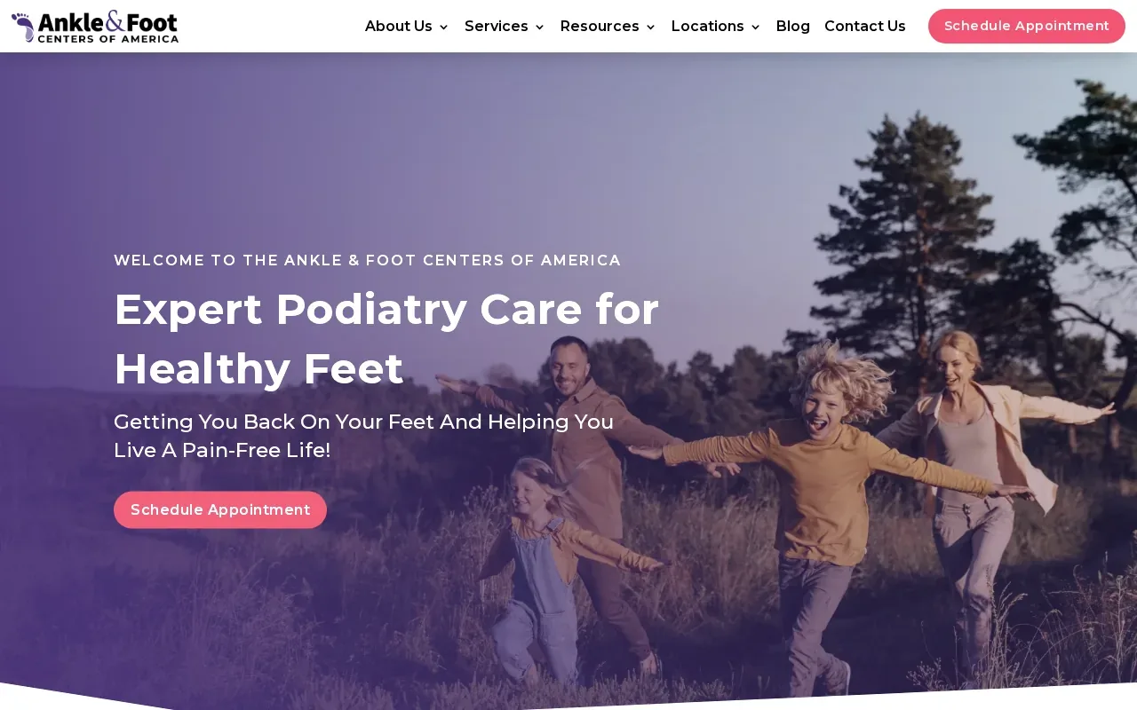
For a group practice, visitors need two kinds of information. They need to understand what the organization treats, and they need to work out which center is right for them. A location page should make the local clinic easy to identify, while the wider site can explain the group’s approach and range of care.
The practice describes options that include conservative care, such as orthotics and physical therapy, as well as surgery. It also publishes educational material on conditions such as ingrown toenails, flat feet, and hammertoes. This can help a site connect general practice information with pages that address a patient’s specific concern.
For your own clinic, keep local pages distinct enough to help people choose a location. Make the appointment path visible from both the main site and each center’s page. A visitor shouldn’t need to return to the home page to figure out what to do next.
5. Colorado Foot and Ankle: A regional practice website to review
Colorado Foot and Ankle is another regional practice name to add to your browsing list. The name makes geography part of the brand. When you visit the site, use that as a starting point for checking how clearly the practice explains the areas it serves and how a local patient can find the right care.
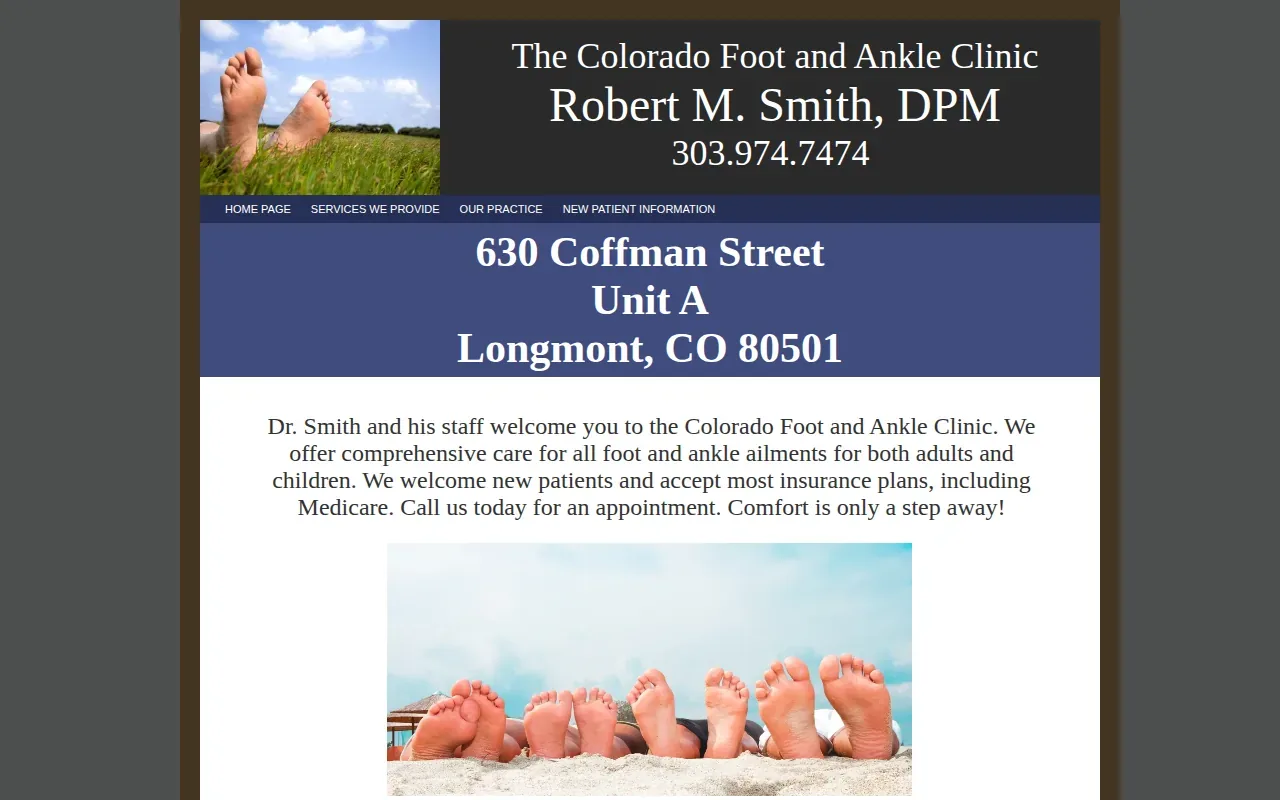
Look at the home page first. Does it introduce the practice in plain terms? Can you find provider details and the services offered without searching through several layers of navigation? Then open the site on a phone and repeat the same checks. The mobile menu should make core pages easy to reach.
Next, look for condition-focused information. A patient may search for help with plantar fasciitis, heel pain, or a hammertoe rather than the name of a procedure. Pages that use familiar language can give visitors a clearer route from their concern to the clinic’s services.
Pay attention to the appointment step as well. A visible action should tell patients what to do next, and location details should be easy to confirm. These are useful review points for any regional practice site, even when the clinic’s care covers more than one city.
6. Foot & Ankle Center of Nebraska: An established practice presence
Foot & Ankle Center of Nebraska describes nearly five decades of podiatric care since 1978. Its team includes seven doctors and serves patients across Nebraska and Iowa. The practice says it provides care from routine visits through complex procedures, with a focus on patient education and personalized attention.
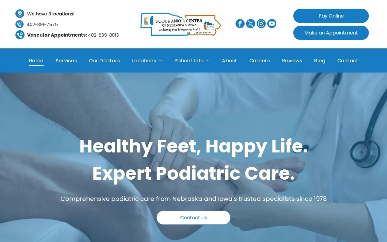
Those details give the site a strong starting point for explaining who the clinic is and whom it serves. Provider biographies can build on that overview by helping patients learn about the doctors’ training and areas of care. Service pages can then explain the concerns the practice treats and what patients may expect when they seek help.
The practice also has expert tips, news, and resources for patients. An educational section can answer common questions and give people a useful place to learn before an appointment. Keep each article focused on a clear question, and link it to the relevant service page so readers can find the next step.
For a clinic with a long history, the key is to make the present-day practice just as clear as its story. Show the current team, the locations served, and the route to scheduling. A history statement can add context, but patients still need current information they can act on.
FAQ
What should a podiatry website include?
A podiatry website should explain the practice, introduce its providers, and show which conditions and services it treats. It should also make location details and appointment scheduling easy to find. Patient reviews can add useful context, while a focused FAQ or education section can answer common questions before someone books.
How can I make a podiatry practice website easier to use?
Make the main patient tasks easy to spot: finding a service, checking a location, learning about a provider, and booking an appointment. Use plain words for condition names, keep the menu simple, and test the site on a phone. A patient should be able to move from a concern to the right service page without hunting.
Should podiatrists have separate pages for conditions?
Separate condition pages can help patients find information that matches the problem they’re searching for. A page about heel pain, for example, can explain whether the clinic treats it and point to the next step. Keep each page accurate and useful, and avoid making several pages that repeat the same general text.
What should I look for in a podiatry website example?
Check whether the site makes the practice’s focus clear, shows who provides care, and explains its services in patient-friendly language. Then test the location details and appointment path on a phone. The best examples for your clinic are those that make it easy to answer a visitor’s real questions, not simply those with a polished look.
Conclusion
Choose one or two examples above that match your clinic’s size and patient base, then review them on both desktop and mobile. For support with your own site’s search visibility, Distribb.io’s podiatry SEO service can help clinics build ongoing search work around their site.