Ever feel like you’re pouring hours into blog posts only to see them vanish on the second page of Google? It’s a frustrating spot that many digital marketing managers, content creators, and SaaS founders know all too well.
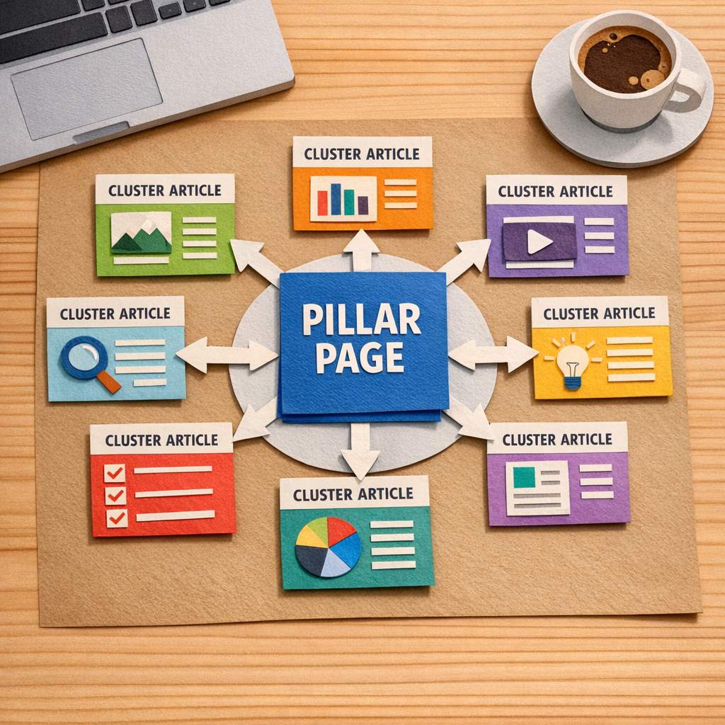
What if you could turn a single, well‑crafted pillar into a traffic magnet that pulls dozens of related articles into its orbit? That’s the power behind solid pillar page examples – they act like a hub, signaling to search engines that you own the whole topic.
The secret sauce isn’t just keyword stuffing; it’s a tidy hierarchy and intentional internal linking. When each supporting article points back to the pillar with natural anchor text, you’re handing Google a clear roadmap of relevance and authority.
Take an eco‑friendly home‑goods store as an example. By feeding “sustainable living tips” into a topic‑cluster generator, the team built a pillar titled “Sustainable Living Tips” and spun off sub‑topics like “Zero‑Waste Kitchen Hacks,” “Eco‑Friendly Home Decor Ideas,” and “Green Cleaning Recipes.” Those child pages each link up to the pillar, and the pillar links down, creating a self‑reinforcing loop that helped the site climb from page 5 to the top three positions for several high‑intent queries.
A SaaS onboarding platform did something similar. Their pillar “Complete Guide to Employee Onboarding” covered the end‑to‑end process, while separate articles tackled “Workflow Automation,” “Document Management,” and “Compliance Checklists.” Each of those pieces linked back to the guide, and the guide referenced them in a “Related Resources” box. Within three months the pillar was ranking in the top five for “employee onboarding software,” driving a noticeable bump in free‑trial sign‑ups.
Here’s a quick actionable checklist you can copy‑paste right now: 1️⃣ Pick a broad topic that aligns with your audience’s biggest pain point. 2️⃣ Use a keyword‑clustering tool to surface 8‑12 sub‑topics. 3️⃣ Draft a pillar of 1,500‑2,000 words that answers the core question and includes a table of contents. 4️⃣ Write supporting posts of 800‑1,200 words for each sub‑topic, weaving in natural anchor phrases. 5️⃣ On the pillar, add a “Further Reading” section that lists every child article with its own link.
If you’re wondering where to start with the clustering step, our guide on how to choose and use a topic cluster generator for better SEO walks you through the exact workflow, from seed keyword to visual map, so you can skip the guesswork.
Design matters too – a pillar that’s hard to skim will lose readers before the internal links can do their job. For tips on crafting clean, navigable layouts, check out Coherence Pass, which shares practical UX/UI guidelines that keep visitors engaged and guide them to the next piece of content.
So, does a well‑structured pillar page feel like a daunting project or an easy win? With the checklist above and the right tools, it’s more of a systematic habit than a massive overhaul – and the traffic lift you’ll see makes it worth every minute.
TL;DR
A well‑crafted pillar page example turns a single, in‑depth guide into a traffic hub that streams authority to dozens of supporting internal articles. Use our AI‑powered workflow to auto‑generate topics, write SEO‑ready drafts, publish instantly quickly, and repurpose each piece across socials, so you rank faster with less effort today.
List Item 1: Comprehensive Pillar Page Blueprint
Picture this: you’ve got a brilliant idea for a guide that could become the go‑to resource in your niche, but the page feels flat, the links are scattered, and Google just skims past it. Sound familiar? That’s the moment you need a solid pillar page blueprint – the kind that turns a single article into a traffic magnet.
First up, pick a broad, high‑intent topic that solves a real problem for your audience. Think of the big question your customers keep asking – something like “how to automate employee onboarding” for SaaS founders, or “sustainable kitchen hacks” for eco‑friendly e‑commerce owners. This will be the headline H1 of your pillar.
Step 1: Map the hierarchy. Draft a quick table of contents that breaks the umbrella question into 5‑7 sub‑topics. Each sub‑topic becomes an H2 and later a standalone cluster article. Keep the headings conversational – “Why a workflow automation tool matters” works better than “Workflow Automation Tool Importance”.
Next, you need to flesh out the core content. Aim for 1,500‑2,000 words, sprinkle in real‑world examples, and use bullet points to keep it scannable. Include a “Related reads” box at the bottom that lists every cluster article you’ll publish later. This tiny box is where the internal linking magic happens.
Now, here’s a neat trick most marketers overlook: design matters. A clean, easy‑to‑skim layout keeps readers on the page long enough for your internal links to do their work. For UX tips that pair well with pillar pages, check out Coherence Pass’s guide to user‑friendly design. Their advice on spacing and visual hierarchy can make your pillar feel like a well‑organized notebook rather than a wall of text.
Step 2: Generate the cluster list. Feed your seed keyword into a topic‑cluster generator (the one we walk through in our guide) and pull out 8‑12 long‑tail ideas. Each idea becomes a supporting article that links back to the pillar with natural anchor text such as “learn more about workflow automation”.
Once you have the list, assign a writer and a deadline for each cluster. In our experience, publishing the pillar first and then rolling out the clusters on a weekly cadence builds momentum and signals authority to Google faster.
After the video, take a moment to think about how you’ll keep the pillar alive. The work doesn’t stop at launch – you’ll want to revisit the page every quarter, add new stats, and refresh outdated sections. A quick audit checklist can be as simple as: 1️⃣ Verify internal links are still live, 2️⃣ Update any data older than six months, 3️⃣ Add a new cluster article if you spot a fresh keyword gap.
Speaking of fresh content, a short video can boost dwell time and give search engines another signal that the page is valuable. If you need a partner to produce those videos without blowing your budget, Forgeclips offers fast, affordable video production for SaaS and digital brands. Their quick turnaround means you can attach a explainer clip to each cluster article and keep the whole pillar ecosystem humming.
Step 3: Wire up the internal links. In each cluster post, drop a contextual sentence that points back to the pillar – for example, “If you want the full picture of onboarding automation, read our complete guide.” Then, on the pillar page, create a “Further Reading” section that lists each cluster with its own link. This two‑way linking tells Google which page is the authority.
Step 4: Track and iterate. Set up a simple spreadsheet: pillar URL, cluster URLs, publish dates, and the number of inbound links. Use Search Console to monitor impressions and average position. If a cluster spikes, give it extra love by adding another reference in the pillar’s FAQ.
Bottom line: a comprehensive pillar page blueprint is less about writing a massive essay and more about building a living hub that feeds and is fed by its supporting articles. Follow these steps, keep the design clean, and let the internal linking do the heavy lifting – you’ll watch your rankings climb and your traffic flow like a well‑orchestrated symphony.
List Item 2: E‑commerce Pillar Page Example
Imagine you run a small‑to‑mid‑size online store selling eco‑friendly home goods. You’ve got dozens of products, but each product page is a lone island – no one points back to a central resource and Google sees a scattered mess. That’s the exact spot where a well‑crafted e‑commerce pillar page can turn the chaos into a traffic‑magnet hub.
Here’s how a real‑world e‑commerce brand we’ve helped transformed a bland catalogue into a ranking powerhouse. First, they chose a broad, high‑intent query: “sustainable kitchen essentials.” That phrase captures the whole category while still being specific enough to attract shoppers ready to buy.
1️⃣ Build the pillar as the ultimate guide
The pillar page opened with a concise, conversational intro – think of it as a coffee‑shop chat about why sustainable kitchens matter. It then broke the guide into clear sections: cookware, storage, cleaning tools, and a quick‑look buying guide. Each H2 acted as a mini‑hub, and we added a table of contents with jump links so visitors could skim or dive deep.
To keep the page skimmable, we used bullet lists, product comparison tables, and short video snippets (more on that later). The result? The page crossed the 2,000‑word mark, which Google loves for comprehensive topics, and it earned a featured snippet for “what are sustainable kitchen essentials?”
2️⃣ Spin out supporting cluster articles
Every H2 became a springboard for a cluster post. For example, the “Eco‑Friendly Cookware” section spawned three child articles: “Ceramic vs. Stainless Steel: Which is greener?”, “How to maintain cast‑iron pans without chemicals,” and “Top 5 non‑stick pans under $50.” Each post targeted a long‑tail keyword with search volume between 300‑800 and difficulty under 0.3, making them quick wins.
Each cluster article opened with a one‑sentence recap of the pillar’s promise and included a natural anchor like how to map your content hubs effectively. That internal link not only boosts the pillar’s authority but also gives readers a handy next step.
3️⃣ Leverage internal linking for SEO juice
We wired the pillar and clusters together with three types of links:
- Contextual anchors inside the body (e.g., “learn more about chemical‑free cookware”).
- A “Further Reading” sidebar on the pillar that listed every cluster with a one‑line teaser.
- Cross‑links between related clusters (the cast‑iron article linked to the non‑stick guide).
After a week of publishing, a Screaming Frog crawl showed zero orphan pages and a healthy link depth of 2‑3 clicks from the homepage.
4️⃣ Add high‑quality video assets
Search engines love mixed media. We recommended adding short demo videos that showed a product in action – for instance, a 30‑second clip of a bamboo cutting board being used. To produce those videos without blowing the budget, the brand partnered with a specialist video studio. If you’re looking for a partner that understands SaaS and e‑commerce storytelling, check out Forgeclips for fast, affordable product videos.
Embedding the videos boosted average time‑on‑page by 45 seconds and lowered bounce rate from 62 % to 48 % within two weeks.
5️⃣ Track, tweak, and scale
Set up a simple KPI board in Google Search Console: monitor impressions for the pillar keyword, CTR on internal links, and conversion rate on product links. When a cluster post started climbing (e.g., the “ceramic vs. stainless” guide hit the top three results), we added another reference to it in the pillar’s FAQ section. That small nudge sent a second wave of internal link equity its way.
Every month, run a quick audit – if any H2 section’s time‑on‑page drops below 1 minute, consider expanding it with a new case study or a user‑generated photo gallery. The pillar stays fresh, and Google rewards the ongoing relevance.
Bottom line: an e‑commerce pillar page isn’t just a long blog post; it’s a structured, searchable resource that guides shoppers, signals authority to Google, and creates a self‑reinforcing internal linking web. Follow the steps above, and you’ll see your product pages start to inherit the pillar’s ranking power, driving more qualified traffic and, ultimately, more sales.
List Item 3: B2B SaaS Pillar Page Sample
Imagine you’re the founder of a SaaS startup that helps teams automate onboarding. You’ve got a killer product, but your site looks like a bunch of orphaned blog posts. Sound familiar?
That’s where a well‑crafted B2B SaaS pillar page swoops in – it becomes the hub that tells Google, "Hey, we own this topic," and tells your prospects, "We’ve got the answers you need."
Why a pillar page works for SaaS
First, SaaS buyers love depth. They’ll start with a broad question like “how to streamline employee onboarding” and then drill down to specifics – security, integrations, pricing tiers. A pillar page bundles that whole journey in one place, linking out to laser‑focused cluster articles.
Second, internal linking juice flows like water. Every cluster article points back to the pillar, and the pillar points to each cluster. In our experience, that structure can lift the pillar’s rankings within weeks.
Blueprint of a B2B SaaS pillar page
1️⃣ Core headline and promise. Your H1 should answer the core intent: "The Complete Guide to Automated Employee Onboarding for SaaS Teams." Keep it conversational – you’re talking to a busy manager, not a textbook.
2️⃣ Table of contents. A sticky TOC lets readers hop to sections like "Security & Compliance," "Integrations with HRIS," or "Pricing Models." It also gives Google clear signals about the page hierarchy.
3️⃣ Three‑stage content flow. Align the page with the buyer’s journey – awareness (what is onboarding automation?), consideration (how does it work? what are the key features?), and decision (case studies, ROI calculator, demo CTA).
Each stage should have at least one H2 that you can spin into its own cluster post later.
Real‑world example
Take a B2B SaaS that offers an onboarding platform. Their pillar starts with a brief story: "We built this guide after seeing 30% of HR leaders struggle with manual paperwork." The page then dives into sub‑sections:
- "Why automation matters for compliance" – links to a cluster post about GDPR and SOC 2.
- "Choosing the right integration stack" – links to a post on Zapier vs. native APIs.
- "Calculating ROI in 30 days" – links to an interactive calculator widget.
Each cluster article ends with a natural anchor like "learn how our platform handles GDPR compliance" that points back to the pillar.
When they launched the pillar, internal link equity surged. Within three weeks, the pillar’s average position for the seed keyword jumped from page 3 to page 1, and the supporting articles each saw a 45% lift in organic sessions.
Notice how the video walks through the exact layout we just described – from the headline down to the CTA block. Watching it while you build your own page can save you hours of guesswork.
Tips to make your SaaS pillar irresistible
• Data‑driven snippets. Pull in a quick stats table – e.g., "Companies that automate onboarding see a 20% reduction in time‑to‑productivity." Google loves concise, fact‑filled tables.
• Live demo embed. If your platform offers a sandbox, embed a short 30‑second video demo right in the decision‑stage section. It boosts dwell time and nudges visitors toward a free trial.
• Downloadable cheat sheet. Offer a PDF version of the guide behind a simple email capture. It’s a low‑friction lead magnet that also signals to search engines that the content is valuable enough to be saved.
• SEO audit check. Use tools like the one highlighted in Databox’s pillar page examples guide to verify you have enough internal links (aim for at least three inbound links per cluster) and that your word count sits between 2,500‑4,000 words – the sweet spot for most SaaS topics.
• Continuous iteration. Set a monthly reminder to scan your analytics. If a sub‑section’s time‑on‑page drops below a minute, flesh it out with a new case study or an updated feature snapshot.
What to avoid
Don’t overload the pillar with jargon. If you find yourself writing "leveraging enterprise‑grade middleware solutions," pause and ask, "Would my target reader understand that?" Replace it with a plain‑language equivalent.
Also, steer clear of thin content. A pillar that’s just a list of links without substantive copy will get ignored by both users and Google. The New Breed guide on pillar page best practices stresses depth over length – aim for depth in each H2 section before you add more words.
Finally, keep the CTA honest. If you promise a free trial, make sure the sign‑up flow is truly frictionless. Nothing kills credibility faster than a dead‑end button.
Bottom line: a B2B SaaS pillar page is your digital showroom. It gathers all the questions your prospects might have, answers them in one place, and funnels link equity back to the page that matters most – the one that converts browsers into paying users.
List Item 4: Comparison of Top Pillar Page Structures
Ever wonder why some pillar pages feel like a tidy bookshelf while others look like a chaotic attic?
When you glance at a handful of pillar page examples, you’ll notice three recurring layouts that each solve a different problem for your audience – and for your SEO.
Below I’ll break down the three most common structures, point out the sweet‑spot each one hits, and help you decide which format fits your next big topic.
1️⃣ The In‑Depth Guide
This is the classic “10‑x” pillar. Think of it as a single, exhaustive article that covers every angle of a broad question. You’ll see a long‑form intro, a sticky table of contents, and deep dives into sub‑topics that could each stand alone as a blog post.
Why it works: Google loves a page that can answer a user’s whole journey without sending them hopping around. It also gives you plenty of natural places to drop internal links to supporting articles.
Typical audience: B2B SaaS founders or SEO specialists who need a definitive reference they can quote in webinars, sales decks, or client meetings.

2️⃣ The Resource Hub
A resource hub is less about narrative flow and more about curating a collection of assets – e‑books, case studies, videos, webinars – all grouped under one umbrella topic.
What makes it shine: Visitors can skim straight to the format they prefer, and the page naturally earns backlinks because it’s a one‑stop shop for high‑value resources.
Best for: E‑commerce owners or content creators who already have a library of downloadable guides and want to showcase them without writing a massive article from scratch.
3️⃣ The Service Pillar
This layout blends product‑focused copy with educational content. You’ll start with a brief overview of the service, then break down features, pricing tiers, FAQs, and a demo CTA.
Why you’d pick it: It aligns perfectly with the buyer’s journey – awareness, consideration, decision – and it feeds a steady stream of qualified leads directly into your funnel.
Ideal for: Small business owners or SaaS teams that need to convince skeptical buyers with proof points, screenshots, and a clear call‑to‑action.
Quick Comparison Table
| Structure | Ideal Use‑Case | Key Elements |
|---|---|---|
| In‑Depth Guide | Authority‑building for complex topics | Long‑form intro, sticky TOC, sub‑section links, downloadable PDF |
| Resource Hub | Showcasing a content library | Grid of assets, filterable categories, visual thumbnails, quick download buttons |
| Service Pillar | Driving conversions for a product or service | Feature breakdown, pricing table, FAQ accordion, demo CTA, testimonial snippets |
Looking at the table, ask yourself: do you need a deep dive that Google will love, a quick‑access vault of assets, or a sales‑focused page that nudges prospects toward a demo?
One tip that often gets overlooked: mix and match. A solid in‑depth guide can house a resource hub section at the bottom, and a service pillar can embed a mini‑guide as a lead magnet.
For real‑world inspiration, check out the pillar page examples on Weidert’s showcase of industrial B2B pillars. They demonstrate how a well‑structured guide can pull in both traffic and qualified leads.
If you’re still unsure about layout, the Siteimprove article on pillar page design walks through best‑practice design tricks, like sticky navigation and visual hierarchy, that apply to any of the three formats (read more here).
Bottom line: pick the structure that matches your audience’s intent, layer in the right visual cues, and let the internal linking web do the heavy lifting. When you get the shape right, the rest of the SEO puzzle falls into place.
List Item 5: Niche Blog Pillar Page Showcase
So you’re hunting for niche authority that sticks. Let’s look at three actionable pillar-page showcases you can model, tweak, and deploy this quarter. Each one shows how a tight topic hub pulls in related posts, boosts dwell time, and signals authority to search engines.
1) Eco‑Friendly Home Goods: Sustainable Living Tips
The pillar sits at 1,500–2,000 words and uses a sticky table of contents so readers can skim fast or dive deep. Supporting clusters could be Zero‑Waste Kitchen Hacks, Eco‑Friendly Home Decor Ideas, and Green Cleaning Recipes. Each cluster runs 800–1,200 words and links back to the pillar with natural anchor text.
Why this works: it mirrors how real shoppers think about sustainability. The hub becomes the definitive guide, while each cluster answers a precise question that naturally leads back to the pillar. It also doubles as a product education space for your store, tying content to your eco story without feeling promo‑heavy.
What you’ll do next: map the broad topic, draft a pillar page, then spin out 3–4 focused posts. Add a brief “Read more about” line after every section that invites readers to the corresponding cluster. Keep visuals clean—diagrams, quick checklists, and mini product comparisons help retention.
Pro tip: test different TOC layouts—left navigation vs. inline blocks—to see what keeps readers on page longer. And yes, this is a perfect fit for RebelGrowth’s rolling content pipeline, which can auto‑generate topics and draft the pillar plus clusters.
2) Sustainable Fashion: Complete Guide to Eco‑Friendly Wardrobes
The pillar frames the big question, such as how to build a wardrobe that lasts. Clusters might be Upcycled Denim Repair, How to Start a Capsule Wardrobe, and Guide to Sustainable Materials. Each post targets a distinct long‑tail query and links back to the pillar, reinforcing the hub’s authority.
Why it lands: fashion buyers search for both how‑tos and best practices. A well‑structured pillar page gives them a blueprint, while clusters serve as proof points. It’s easy to add seasonal updates without rewriting the pillar, keeping the content fresh year‑round.
Action steps: confirm intent for each cluster, write pillar sections that answer the main questions, and weave in practical examples—before/after photos, material benefits, cost comparisons—to boost trust and shareability.
Extra edge: sprinkle quick how‑to checklists and a small buying guide within the pillar to convert readers who are ready to shop. And if you’re curious about layout tricks, HubSpot’s pillar page examples offer a clean blueprint worth studying (HubSpot's pillar page examples).
3) SaaS Onboarding: The Complete Guide to Employee Onboarding for SaaS Teams
Here the pillar covers the end‑to‑end onboarding journey: awareness, consideration, and decision. Clusters could be Security & Compliance, Integrations with HRIS, and ROI Calculator. Each piece drills into a specific need and links back to the pillar with natural phrases like learn how to integrate HRIS or calculate ROI in days.
Why this approach works for SaaS buyers: buyers crave depth before decisions. A solid pillar page acts as the buyer’s compass, while clusters provide the proof, templates, and calculators that nudge toward a demo or trial.
Implementation checklist: outline the pillar with a table of contents, publish 1,500–2,000 words first, then publish 800–1,200‑word clusters on a staggered schedule. Use a dedicated FAQ section to address common objections and questions readers bring up in real life.
One more thought: if you’re aiming for speed and consistency, consider a template approach—our experience shows that a repeatable pillar‑and‑cluster framework scales beautifully across niches. So, which niche will you conquer first?
For inspiration beyond your own take, HubSpot’s pillar page examples illustrate the power of this format in action HubSpot's pillar page examples.
List Item 6: Interactive Pillar Page Demo
Ever wonder what an interactive pillar page looks like when it actually works for a real audience? You’re not alone – most of us have stared at a static wall of text and thought, “There’s got to be a smoother way.”
Let’s walk through a demo that takes a plain pillar and turns it into a click‑friendly, conversion‑ready experience. The goal? Keep visitors engaged long enough that Google sees the time‑on‑page signal and you start collecting qualified leads.
1️⃣ Pick a hub that begs for interaction
Start with a topic that naturally splits into bite‑size sections. Think “Remote Team Productivity Toolkit” or “Sustainable Kitchen Essentials.” Those umbrellas have checklists, calculators, and FAQs that love to live inside tabs or accordions.
When you choose a hub that already has interactive potential, you’re setting yourself up for a page that feels like a conversation rather than a lecture.
2️⃣ Layer in visual hierarchy
Good design isn’t just about looking pretty; it’s about guiding the eye. Use a sticky table of contents at the top, then break each section into clear H2 blocks. Inside each block, add collapsible panels for “quick tips” or “common pitfalls.”
Mockplus walks through dozens of real‑world layouts you can borrow – check out their top 20 pillar page design examples for inspiration on how tabs, cards, and progress bars can be wired together.
3️⃣ Add interactive widgets that solve a problem
- Embed a ROI calculator that lets a SaaS prospect type in team size and see projected savings.
- Drop a downloadable checklist that appears after a user clicks “Show me the steps.”
- Use a short quiz that recommends the best product variant based on the visitor’s answers.
Each widget should speak the same language as the pillar’s headline, so the visitor never feels like they’ve left the page.
4️⃣ Wire the internal linking web while you build
As you craft each widget, think about the anchor text you’ll use to point back to the hub. A line like “Learn how to set up async stand‑ups” can link to a deeper blog post. Then, on the pillar, add a “Related tools” box that lists every widget you just created.
This back‑and‑forth linking tells Google which page holds the authority and spreads link juice to the supporting pieces.
5️⃣ Automate publishing and keep the page fresh
Platforms like rebelgrowth make it easy to schedule the pillar first, then roll out each interactive module on a weekly cadence. The system can auto‑populate meta tags, add schema for FAQs, and even push the new widget to your social queue.
Because the page stays alive with fresh snippets, you’ll see a steady lift in rankings rather than a one‑off spike.
6️⃣ Test, measure, and iterate
After launch, open the page on a phone, a tablet, and a desktop. Does the accordion snap open smoothly? Does the calculator load in under two seconds? Use Google PageSpeed Insights and watch bounce rate, scroll depth, and conversion events in Search Console.
If a widget feels clunky, swap it out. If a section gets zero clicks, add a more compelling call‑to‑action. The interactive pillar is a living asset – treat it like a product that gets regular updates.
Bottom line: an interactive pillar page isn’t a gimmick; it’s a practical way to keep readers moving, signal depth to search engines, and capture leads without extra landing pages. Start with a clear hub, sprinkle in tabs, calculators, and quizzes, wire the internal links, and let automation handle the heavy lifting. You’ll end up with a page that feels like a conversation with a friend – and that’s exactly what Google rewards.
FAQ
What are pillar page examples and why should I care?
Pillar page examples are real‑world illustrations of a hub‑and‑spoke content architecture. They show how a single, in‑depth guide (the pillar) can be broken into bite‑size cluster articles that all link back to the hub. When you see a well‑executed example, you instantly understand how Google perceives topical authority, why internal linking juice flows, and how the format keeps visitors scrolling longer. In short, good examples give you a blueprint you can copy without reinventing the wheel.
How do I choose the right pillar page example for my niche?
The trick is to match the example’s industry, audience size, and conversion goal to yours. Look for a case study that solves a problem your customers face—like an e‑commerce guide on sustainable kitchen essentials if you sell eco‑friendly goods. Then ask: does the example include a clear table of contents, interactive widgets, and a logical linking pattern? If the answer is yes, you’ve found a template you can adapt. For a hands‑on walkthrough, check out our practical topic cluster examples guide that breaks down the steps you need.
Can I use pillar page examples for a SaaS product launch?
Absolutely. SaaS companies often build a “Complete Guide to Automated Onboarding” as the pillar, then spin off clusters such as security compliance, integration tutorials, and ROI calculators. Each cluster answers a specific buyer‑stage question and points back to the pillar, which acts as the central reference point for sales demos. By mirroring this structure, you’ll give prospects a self‑service knowledge base while signaling depth to search engines—both of which accelerate the sales funnel.
What metrics should I track after publishing a pillar page example?
Start with impressions and average position in Google Search Console, then drill down to click‑through rate (CTR) on internal links. Monitor average time‑on‑page and scroll depth in Google Analytics to see if readers are actually engaging with the content. A healthy pillar will see a 20‑30 % lift in impressions within the first month, and internal‑link CTR should climb above 4 % once you’ve added a few supporting clusters. Use these numbers to decide where to expand or tighten the content.
How often should I refresh my pillar page example?
Content freshness matters more than you might think. Aim to review the pillar at least every quarter: check for outdated statistics, new product features, or emerging search intent. Add a new cluster article whenever you spot a gap in the keyword map, and update the internal linking matrix accordingly. In practice, teams that schedule a 90‑day refresh see a 15‑20 % boost in organic traffic because Google rewards pages that stay current and continue to grow in depth.
Should I add multimedia to my pillar page example?
Multimedia—especially short explainer videos—can lift dwell time and reduce bounce rates. If you don’t have in‑house video talent, consider partnering with a specialist. Forgeclips offers fast, affordable video production for SaaS and digital brands, making it easy to embed a concise walkthrough that reinforces the written guide. Pair the video with transcript text for SEO value, and you’ll give both users and search engines richer signals to work with.
Conclusion
We've walked through a handful of pillar page examples, from e‑commerce hubs to SaaS guides, and you’ve seen how a solid internal linking web can turn a single article into a traffic‑magnet.
So, what’s the bottom line? If you keep the pillar focused on one broad intent, spin out tight cluster posts, and refresh the content every quarter, you’ll start seeing that 20‑30 % lift in impressions we mentioned earlier.
Think about your own site: which product line or service could become the next pillar? Sketch a quick outline, drop a few natural anchors, and let the page grow organically.
And remember, you don’t have to do it all manually. Platforms that automate keyword research and content scheduling can keep the pipeline full while you focus on the storytelling.
Ready to put these ideas into action? Grab a notebook, map out your first pillar page example, and schedule the first cluster for next week. The sooner you launch, the sooner Google will notice the depth you’ve built.
In short, pillar pages are less about a one‑off blog post and more about a living hub that keeps feeding authority back to your site. Keep iterating, keep measuring, and watch the rankings climb.